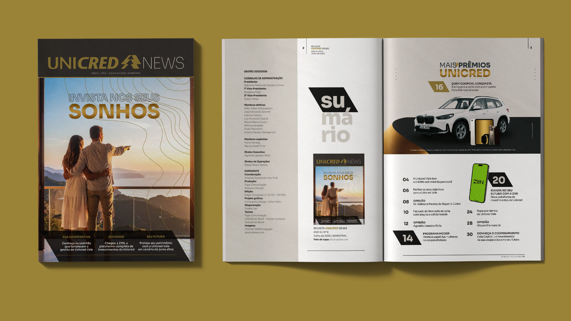
Unicred News – Layout and editorial design
I was responsible for the complete layout of issue Nº 8 of Unicred News Magazine, applying the graphic design developed by Comparsita Design. My work focused on organizing text, images, and advertisements into a cohesive visual flow, ensuring clarity, editorial consistency, and smooth reading rhythm.
Graphic design: Comparsita Design · Aline Fialho
Layout & editorial design: Giselle Zart
Editorial Coordination: Amanda Ávila
Production: Vigia Comunicação · Sistema Unicred
Editing: Edgar Gonçalves Jr.
Texts: Vigia Comunicação · Unicred do Brasil – Núcleo Conexão
Images: Unicred Vale
Structure between chapters
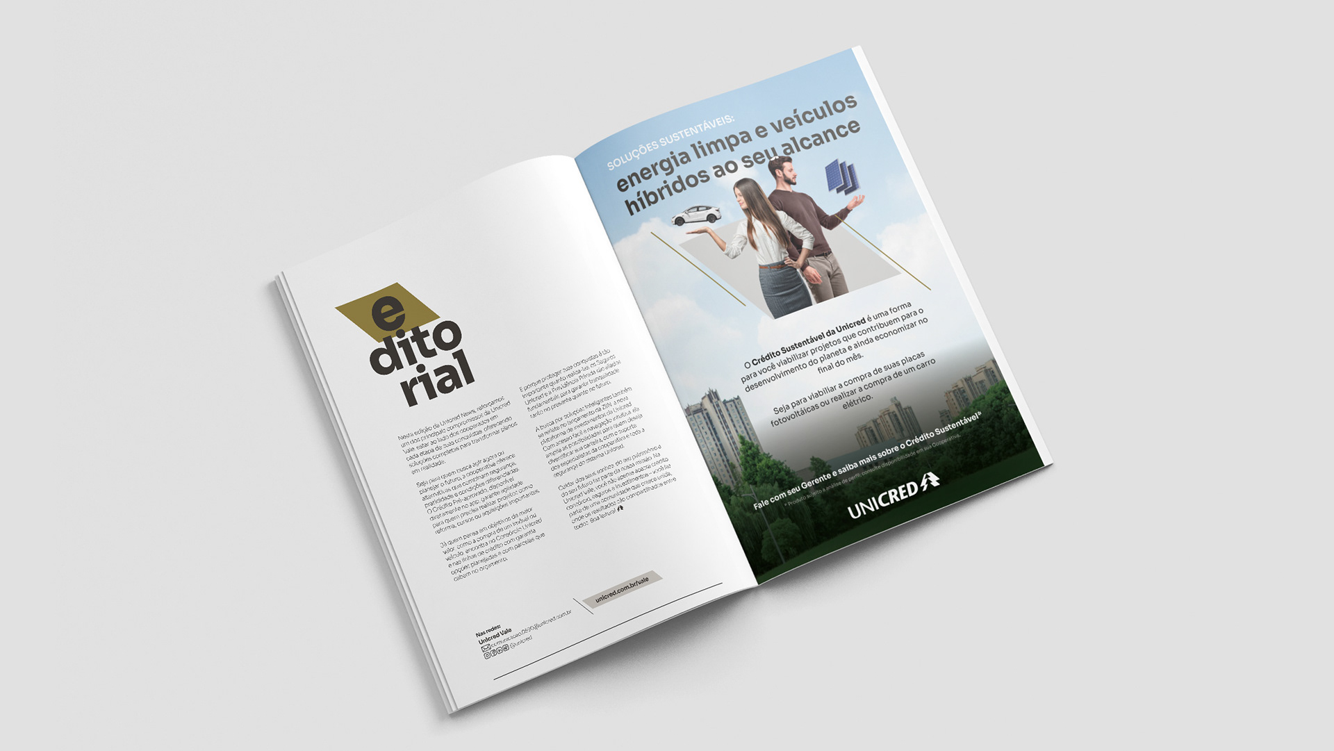
Editorial and table of contents
Initial section that defines typographic hierarchy and sets the tone for the reading experience.
Initial section that defines typographic hierarchy and sets the tone for the reading experience.
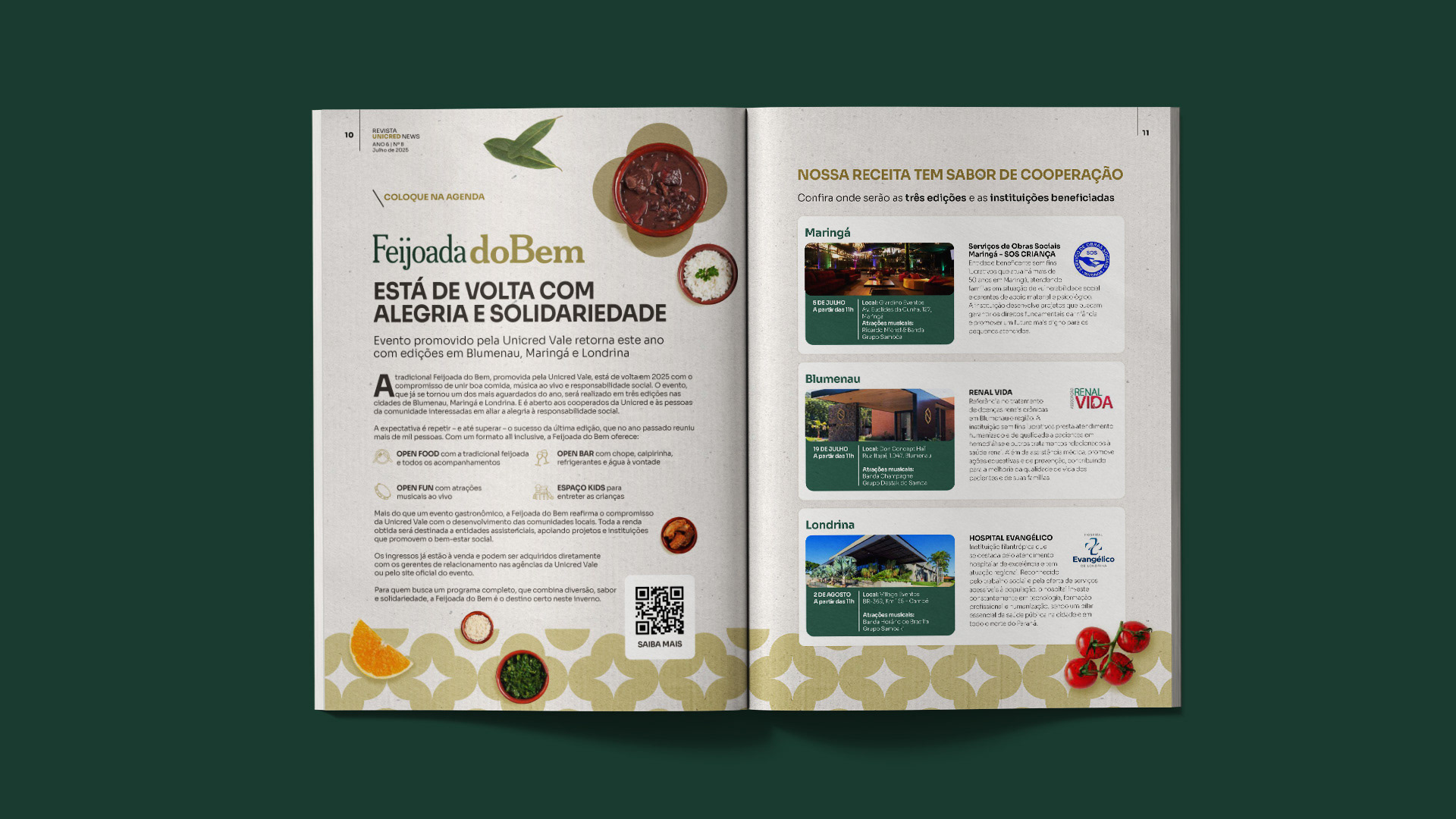
Institutional messages
Dense texts arranged in clear layouts, balancing white space with images and visual highlights.
Dense texts arranged in clear layouts, balancing white space with images and visual highlights.
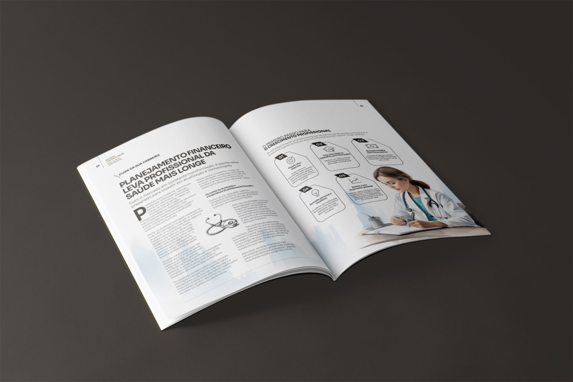
Feature articles
Full spreads designed to create visual rhythm, emphasizing boxes, callouts, and infographics for easier reading.
Full spreads designed to create visual rhythm, emphasizing boxes, callouts, and infographics for easier reading.
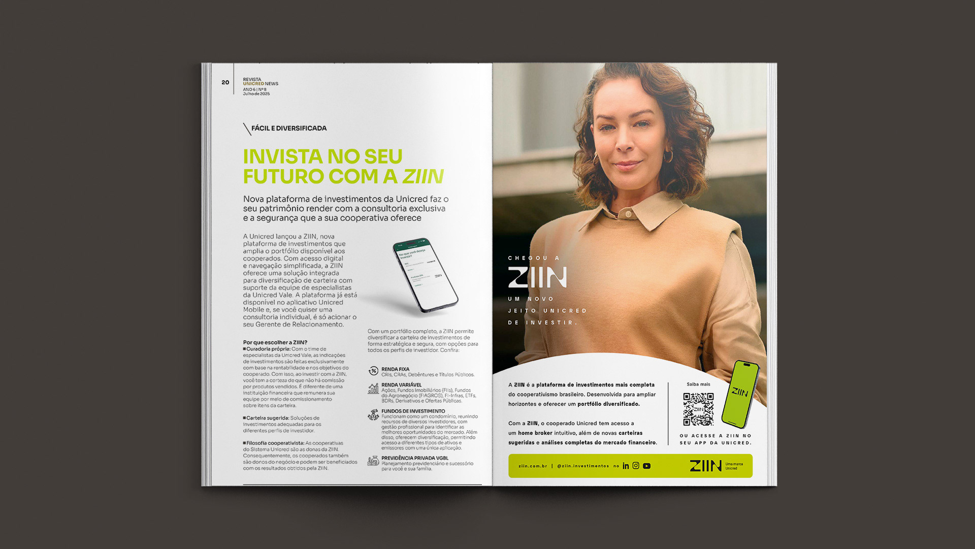
Campaigns and products
Balance between promotional and editorial pages, while maintaining brand consistency.
Balance between promotional and editorial pages, while maintaining brand consistency.
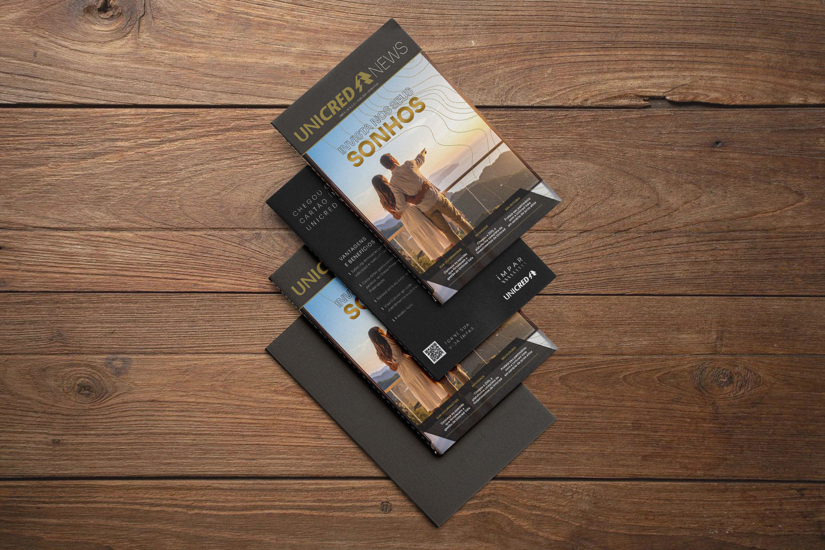
Service sections
Consistent finishing touches that ensure unity from the first to the last page.
Consistent finishing touches that ensure unity from the first to the last page.
The layout was carefully designed to maintain reading flow and visual consistency, always respecting the identity defined by the graphic design. The result is a cohesive, clear, and engaging publication for Unicred members.